THE WIZARD'S CHEST
OVERVIEW
DATE: MARCH, 2017
TYPE: RESPONSIVE E-COMMERCE WEBSITE - HYPOTHETICAL - UX COURSE PROJECT
METHODS: USER INTERVIEWS, COMPETITIVE ANALYSIS, INFORMATION ARCHITECTURE, PROTOTYPING, USABILITY TESTING, RESPONSIVE DESIGN, HTML/CSS, BOOTSTRAP
Description
The Wizard's Chest is an amazing brick and mortar store in the heart of Denver. The store's online presence has a lot of opportunities for usability, but it also does not convey the feelings of excitement and wonder as you step foot into their store on Broadway.
One of the main reflections I had from this project was the importance of this store's role in the gaming community and how to integrate the "fantasty/other world" feel of the store into the website.
DISCOVER
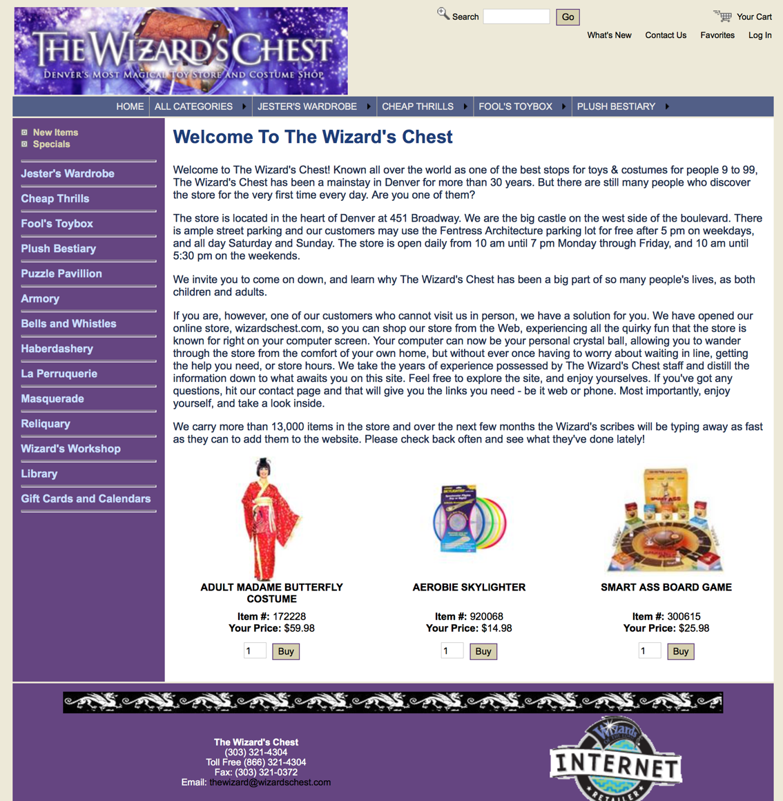
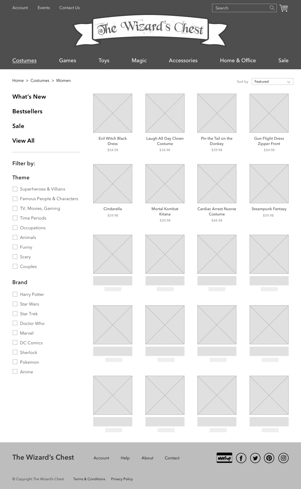
I started by examining the Wizard's Chest current shopping site. The Information Architecture was not very clear, but on top of that, they were using medieval language used for almost of all navigation labeling.
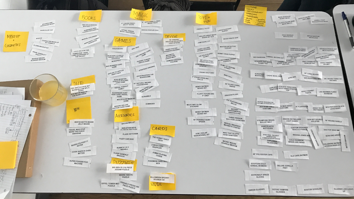
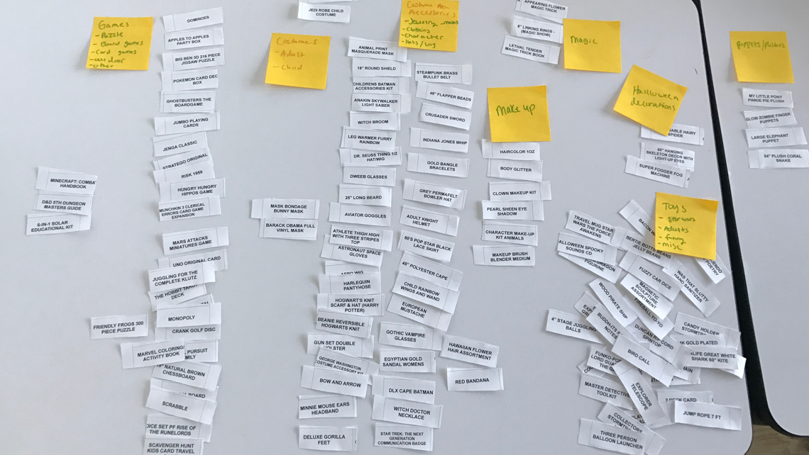
Using an open card sort, I tested three people to determine the best way to re-organize the site navigation. However, all three users had a pile of "Miscellaneous" cards that they could not categorize.
CARD SORT
EMPATHIZE
Realizing the uniqueness of The Wizard's Chest and its clientele, I knew I needed to go visit their store and experience the store first hand. While there I was able to do a few guerilla user interviews with shoppers and gamers.
One of the gift-shoppers I met stated that the amount of products they had was overwhelming, but that the store was a fun experience and enjoyed exploring the shop. She was there to buy a poker set for her boyfriend. She knew she could find a poker set online, but visited this store in hopes to find something more unique. She also visits the store in person when she needs to find costumes for halloween.
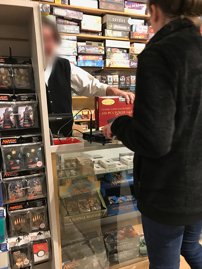
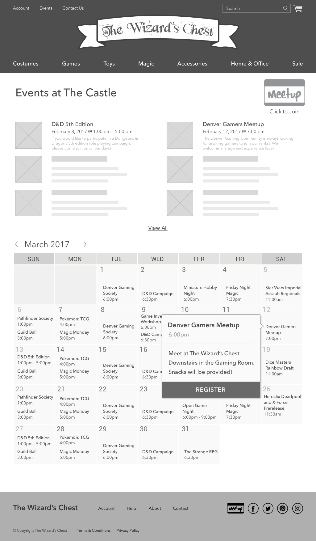
The gamers I interviewed were using the store's facilities to play an elaborate miniatures game. They like supporting their local store and brought up a very important point – the games sold there require players to be physically present. They also expressed concerns about growing their gaming community, and were worried people might be too intimidated to join more experienced players. While the current site lists their events, thought it could be better about encouraging participation and new members.
DEFINE
After going over the research I had gathered, I identified two main personas for the Wizard's Chest e-commmerce site - a gamer and a costumer, each with a unique problem and solution.
PERSONA 1
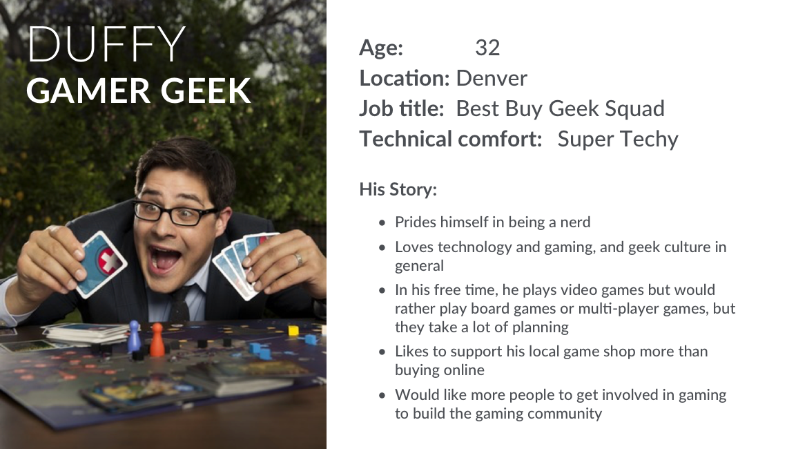
PROBLEM
Duffy is a gamer who prefers board games and role-playing games to video games. These require him to be able to meet with a group of people to play. While he has some friends who also play, it is hard to arrange schedules for everyone to dedicate time to the heavier game-play. Duffy needs a way to find new gamers to play with while supporting his local game store and game community.
SOLUTION
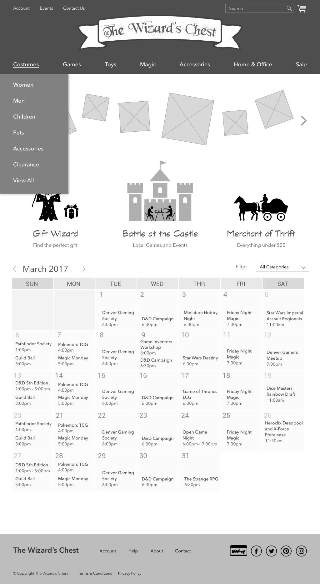
The Wizard’s Chest already hosts games for customers like Duffy, but needs to have a central location to find out about upcoming gaming events, but also can showcase their events on their website to attract more users and help build the gaming community.
PERSONA 2
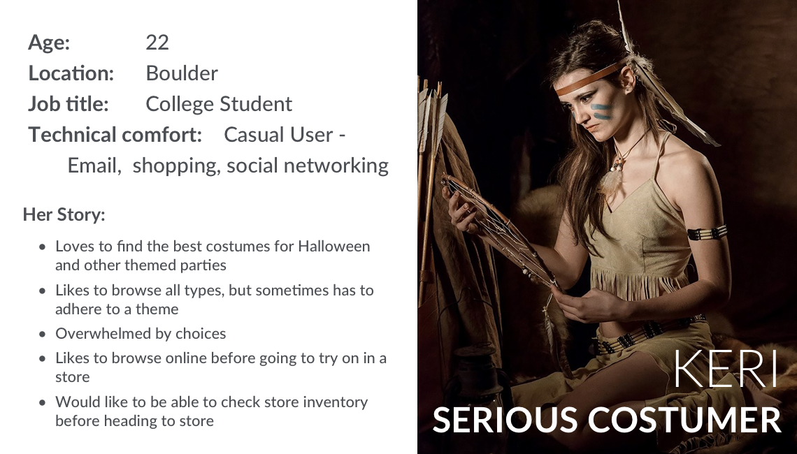
PROBLEM
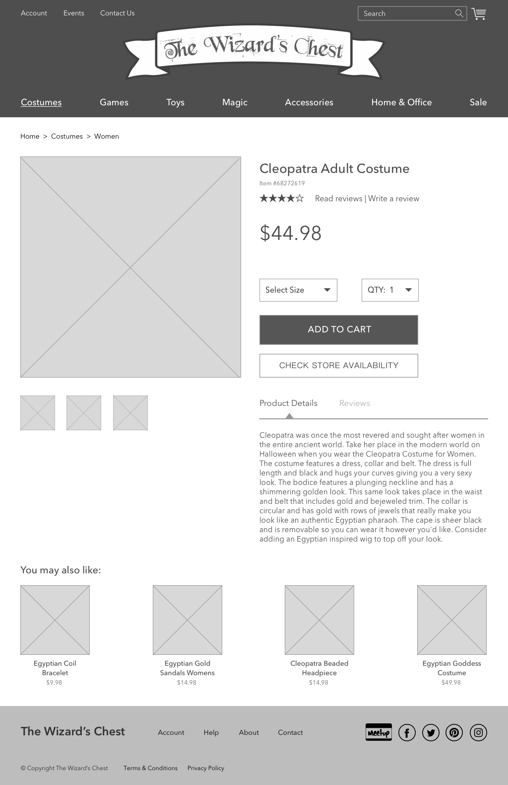
Keri is a college student who loves putting together costumes for Halloween and other events. She does almost all of her shopping online but would like a local store to go in and try on costumes, after she has done her browsing online.
SOLUTION
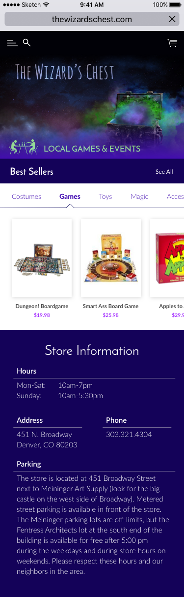
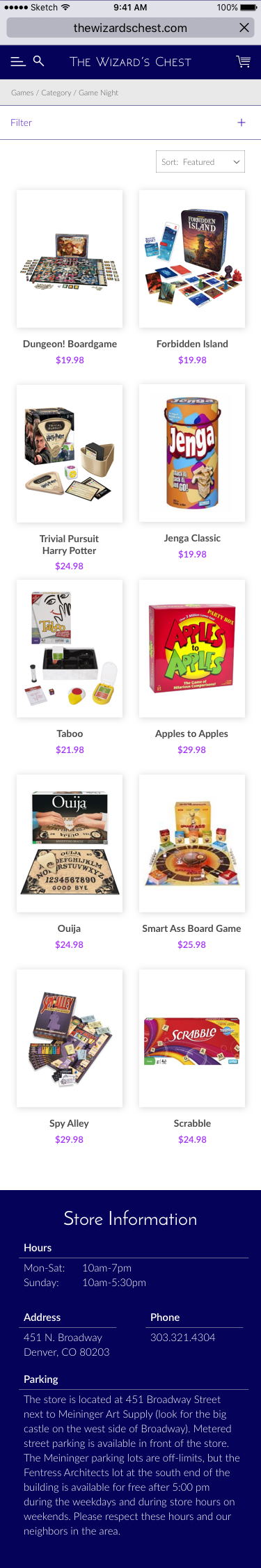
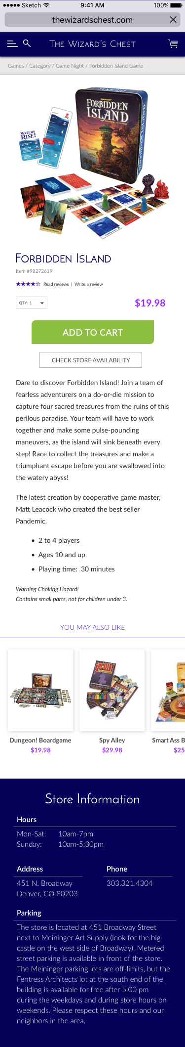
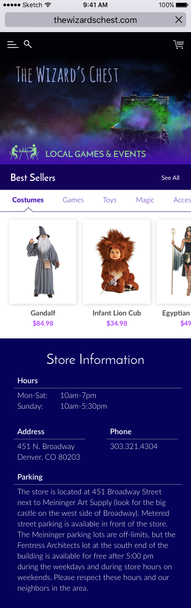
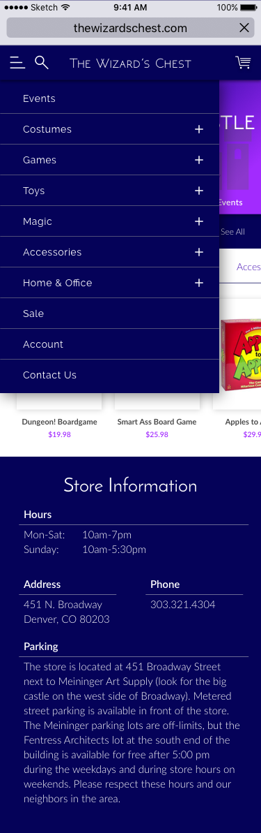
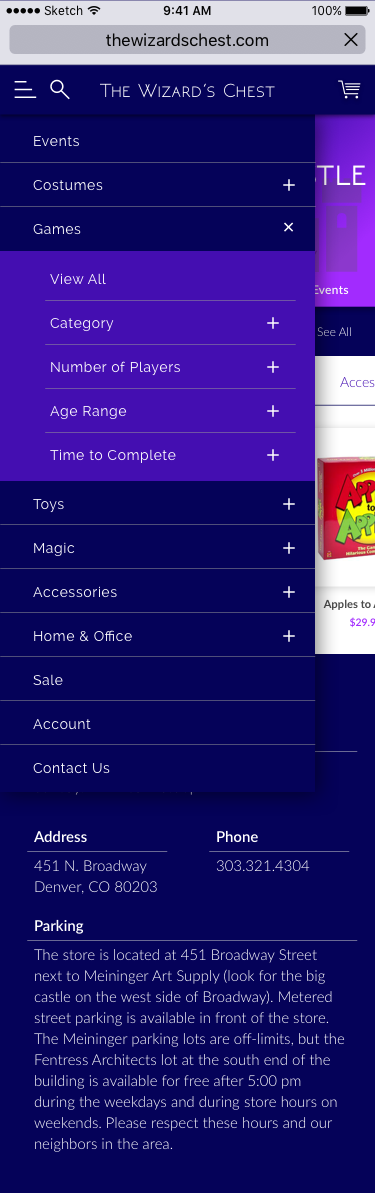
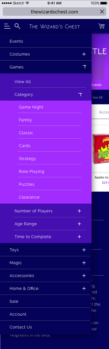
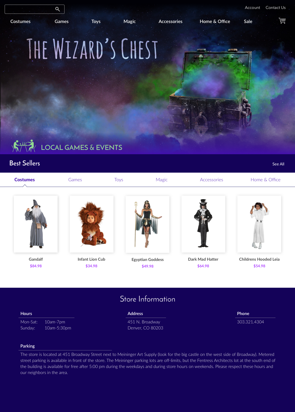
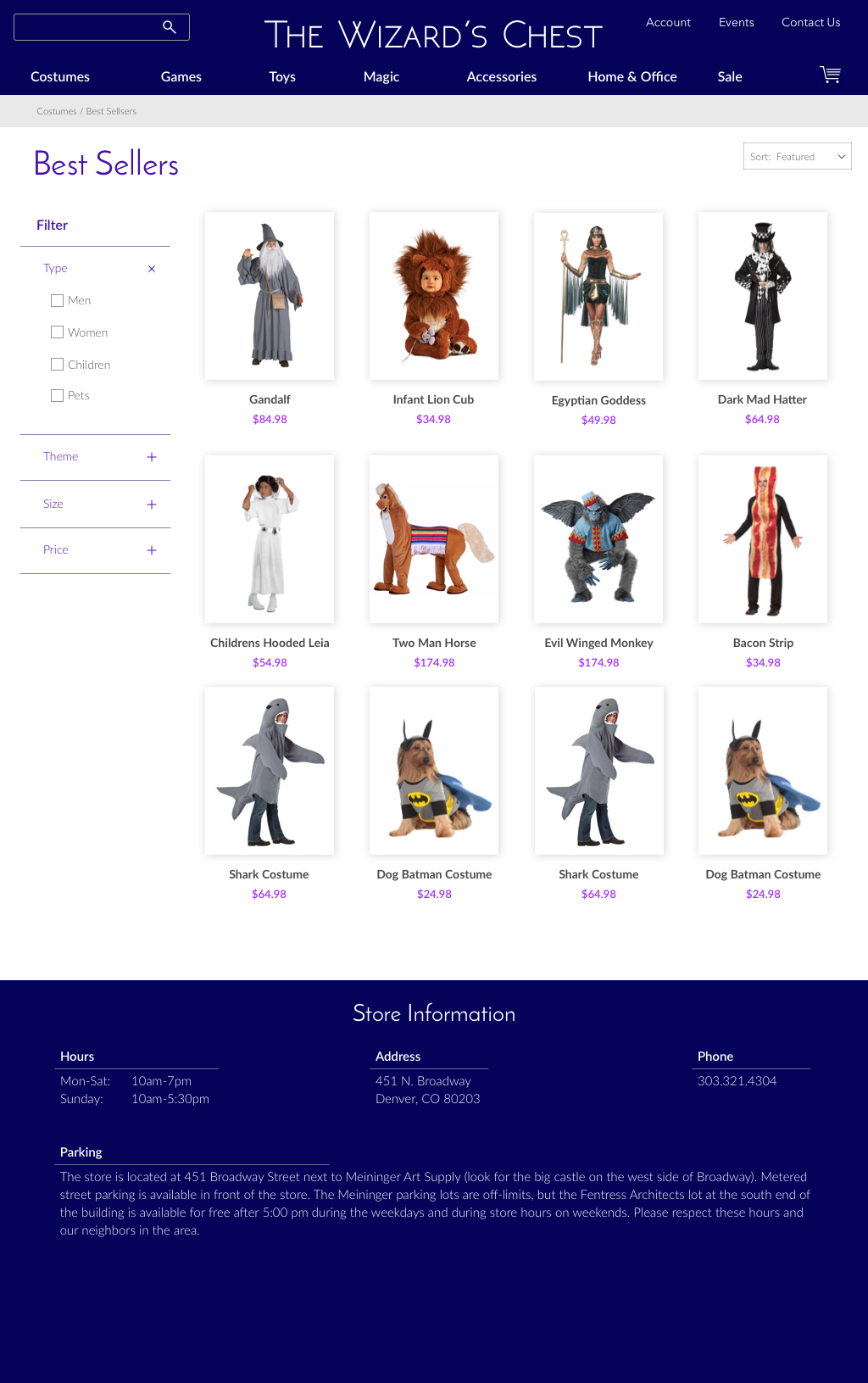
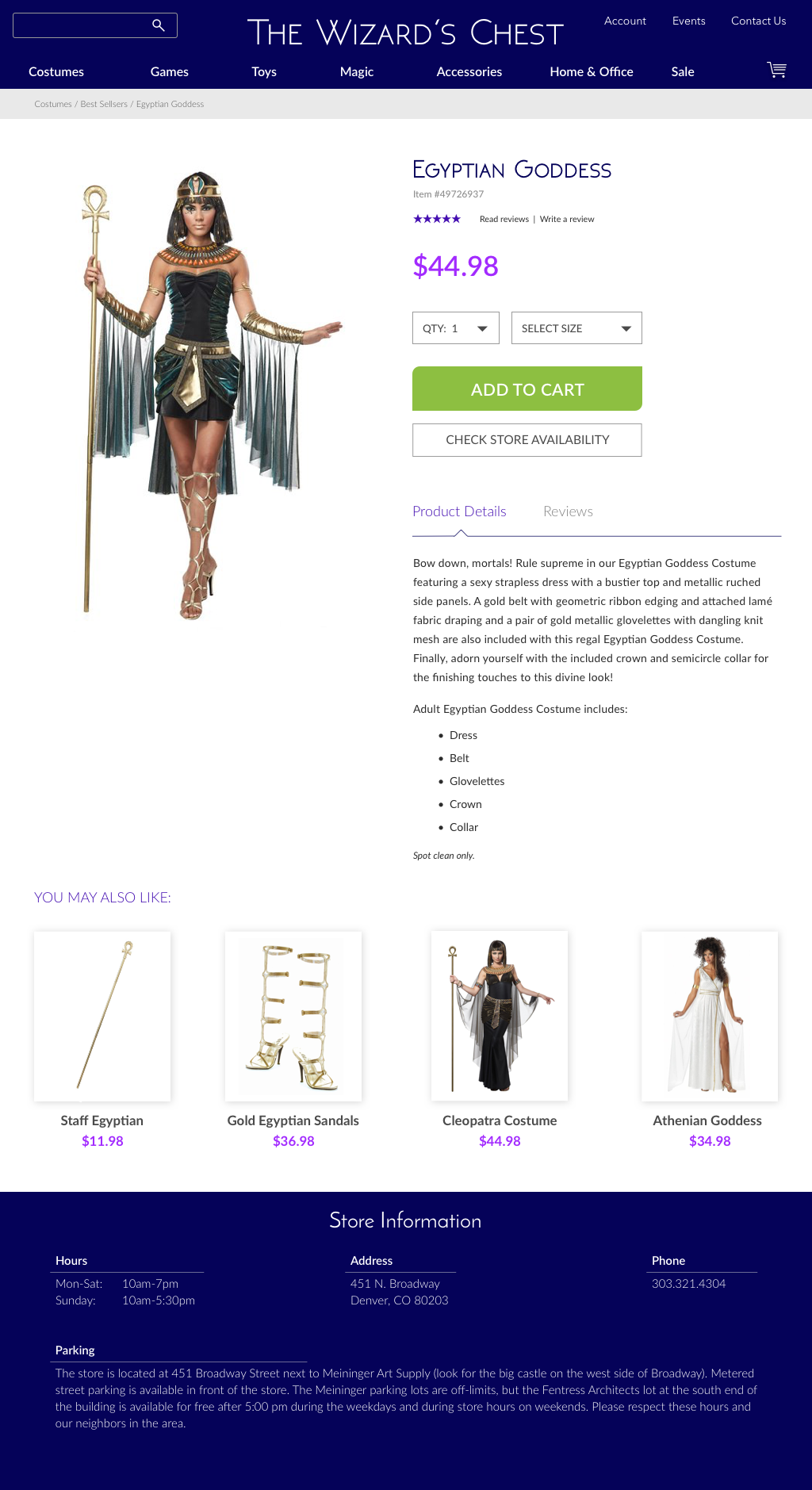
The Wizard’s Chest is the perfect store for Keri, but needs an overhaul on its navigation system for browsing costumes and other products. It also needs to tie back to the store to check inventory for those wanting to come in to try on.
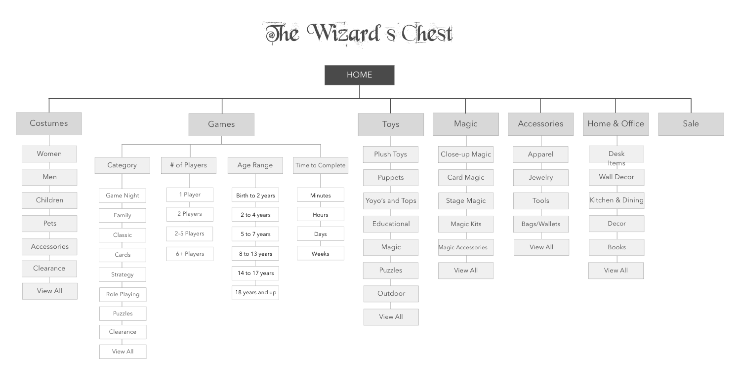
SITE MAP
Based on the two personas and card sort, I tackled the Information Architecture and developed a site map.
IDEATE
Many rounds of lo-fi wireframes were sketched, tested, and revised.
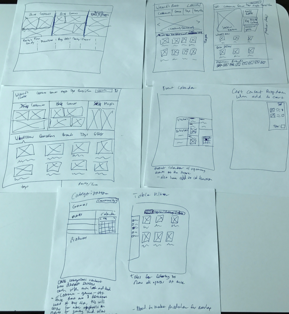

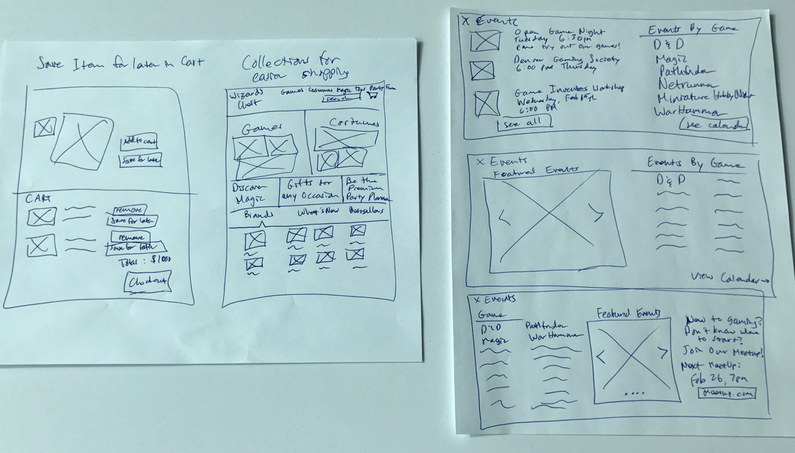
PROTOTYPE
Once the lo-fi wireframes were narrowed down, I created a medium-fidelity prototype in Sketch and Invision.
EXPERIMENT
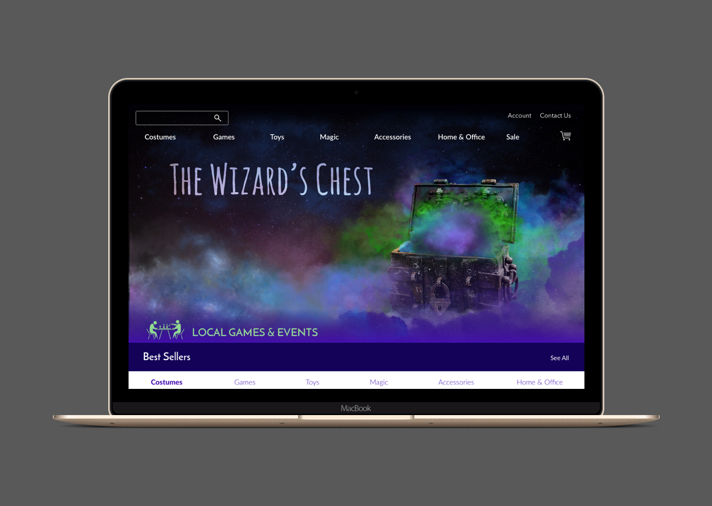
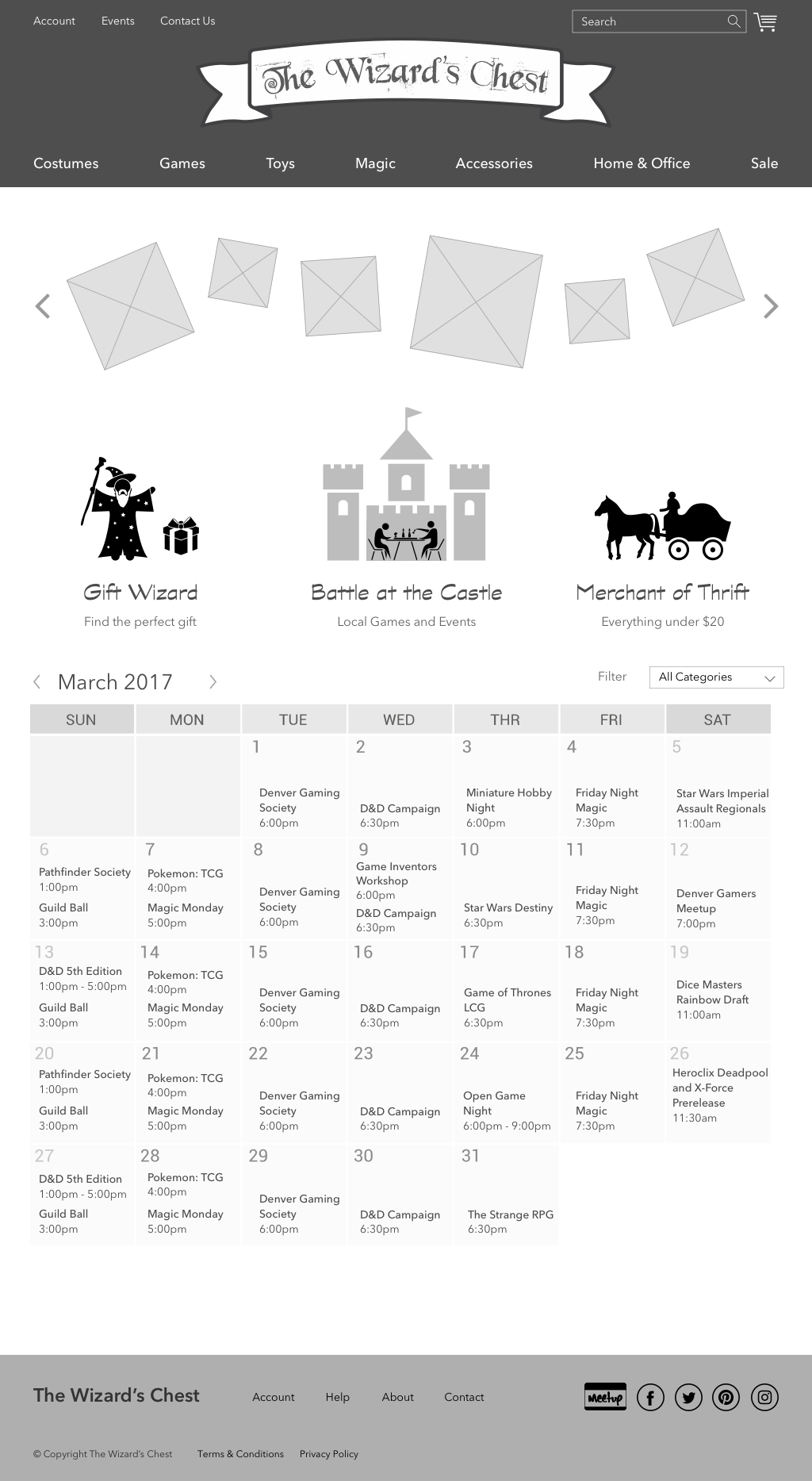
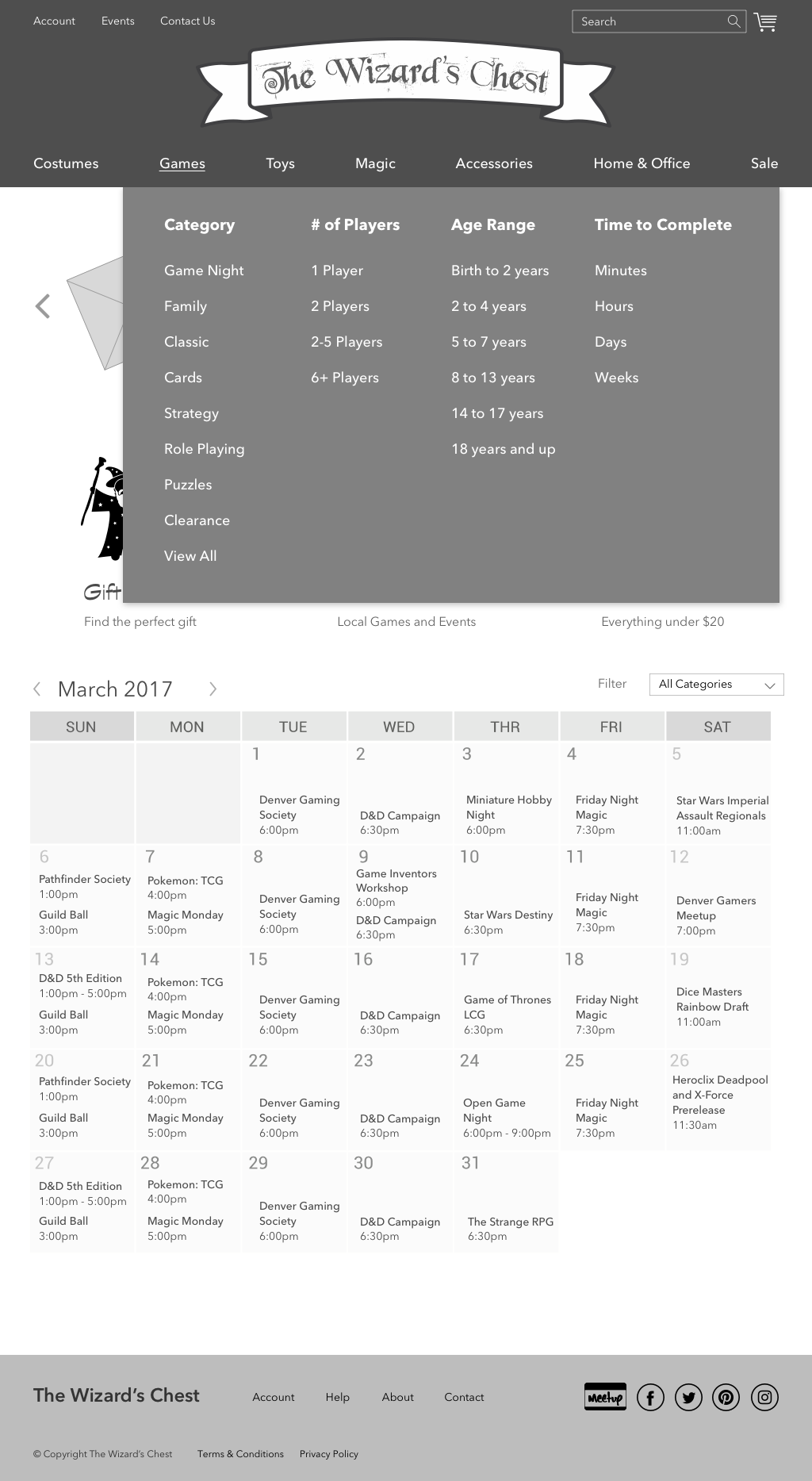
After two rounds of usability tests with the medium-fidelity prototypes, I created full-color mockups in Sketch and Invision and conducted further usability tests.
During this phase, I started with the "Mobile First" method and created a responsive design starting with mobile screens, followed by desktop versions.
REFLECT
I would like to do further testing involving the home page with different features and layout. I also would explore the events section of the site to see if featuring events on the home page affected the local community.
After browsing the vast content of their site, I knew I needed to go visit their store and experience the store first hand. While there I was able to interview shoppers and gamers.