Southwest Bag Tracker
OVERVIEW
DATE: MARCH, 2017
TYPE: HYPOTHETICAL IPHONE APP - UX COURSE PROJECT
MY ROLE: PROJECT MANAGEMENT, USER INTERVIEWS, COMPETITIVE ANALYSIS, CONTENT STRATEGY, INTERACTION DESIGN, PROTOTYPING, USABILITY TESTING
Description
*This was a hypothetical student project for my General Assembly UX course and has no affiliation with Southwest Airlines.
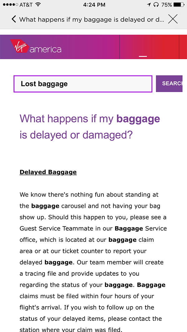
Southwest Airline deals with about 250,000 lost luggage incidents each year. These incidents cost the airline money and are the number one contributor to customer dissatisfaction.
As a team of 3 UXers, our task was to bring those costs down and keep the LUV high by readdressing the lost luggage experience. Our solution focused on the users needs before, during, and after a bag is lost.
DISCOVER
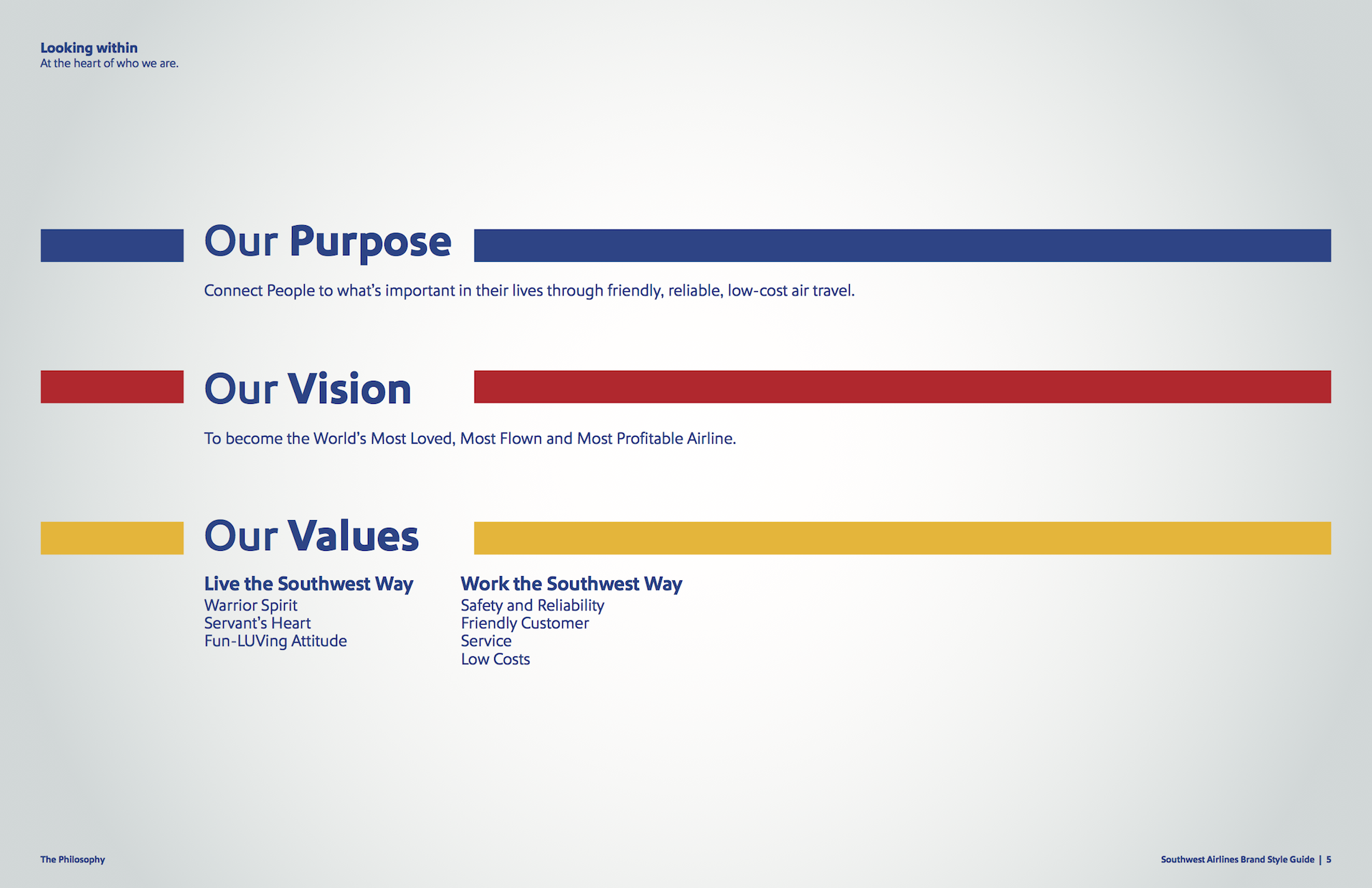
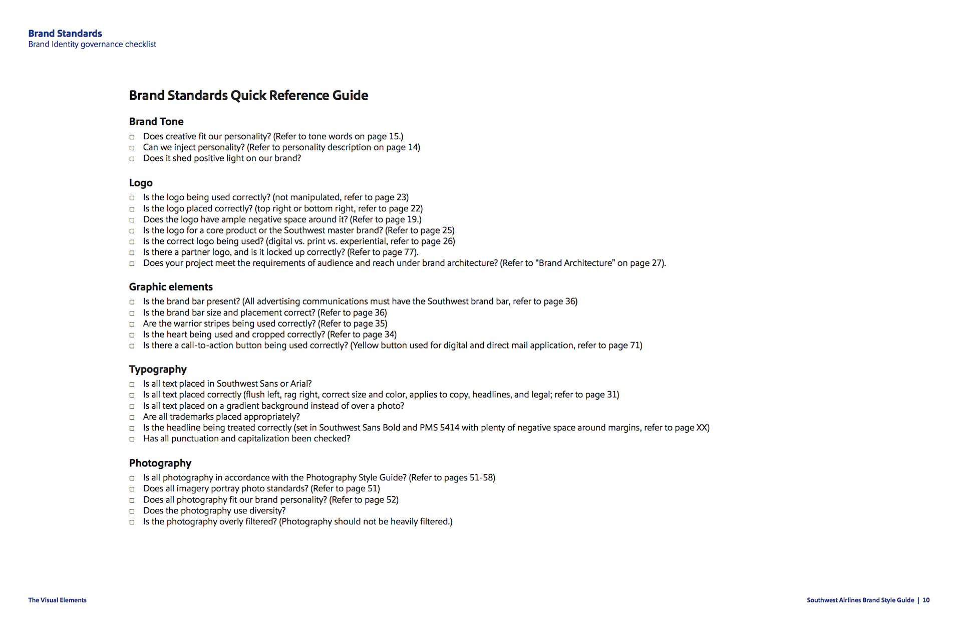
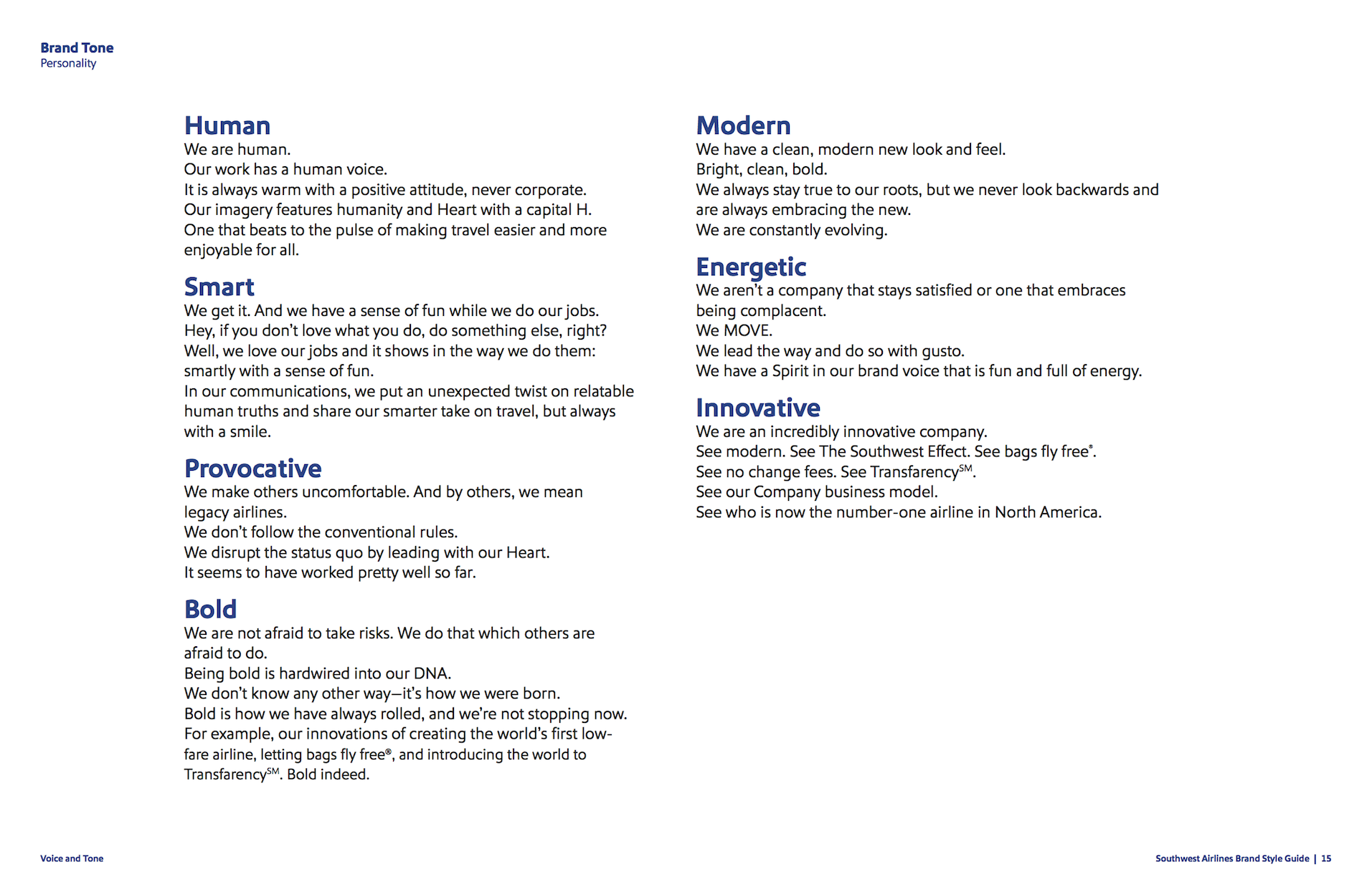
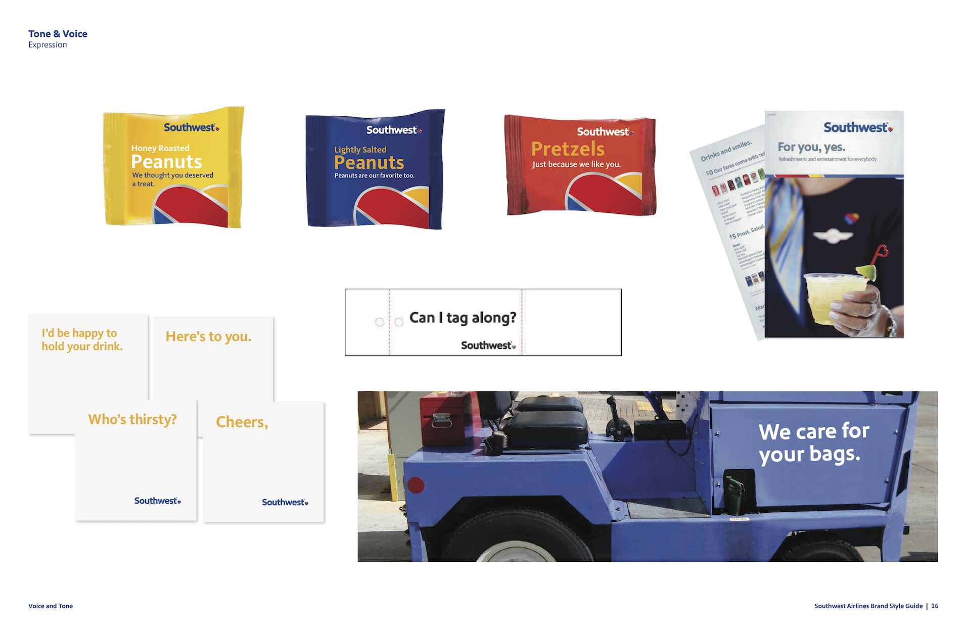
Southwest Airlines is known for having a certain character and had recently undergone a reranding. We wanted to make sure to stay true to the Southwest branding and current customer experience style.
We reviewed the current app. I also found their official Brand Style Guide online and shared it with the main UI designer for the project.
COMPETITIVE ANALYSIS
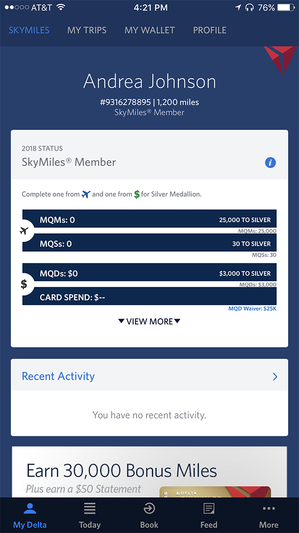
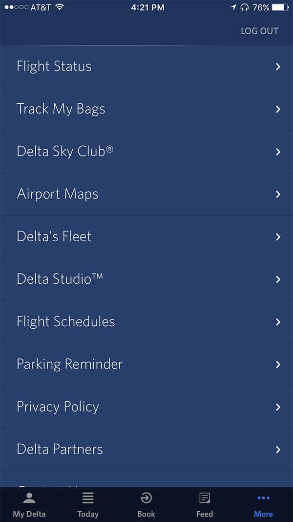
Since I've been referred to as "The App Queen" for my love of apps, this is definitely one of my favorite parts of the process. I downloaded and analyzed over 30 apps of direct and indirect competitors, and shared screenshots with my team. Along with online research, we developed a more complete understanding of the airline app market and gathered different airline UI patterns.

EMPATHIZE
SCREENING SURVEYS & USER INTERVIEWS
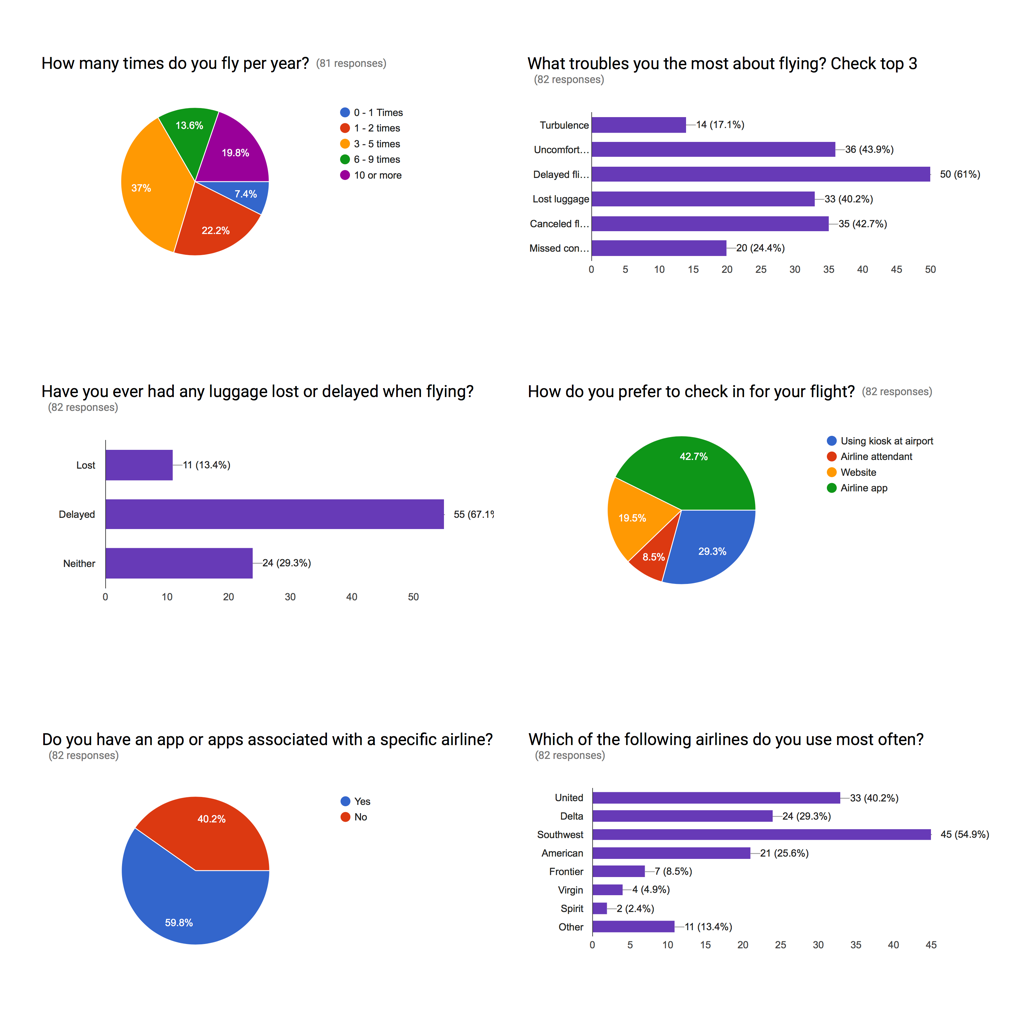
We leveraged all three of our networks, conducting an initial screening survey through social media and received 82 responses. Although our primary goal was to find participants for interviews, we also utilized our Google Form survey to understand some other key elements that would shape our solution:
- Whether people use an airline specific app
- What are peoples preferred method of checking in
- How many people have experienced loosing luggage vs delayed luggage
The next step was to conduct in person or over the phone interviews with anyone who had experienced a loss or delay of luggage. These interviews helped us understand the motivations, goals and pain points of users throughout the experience, which helped to ground us in the users perspective.
DEFINE
SYNTHESIZING RESEARCH - AFFINITY MAP
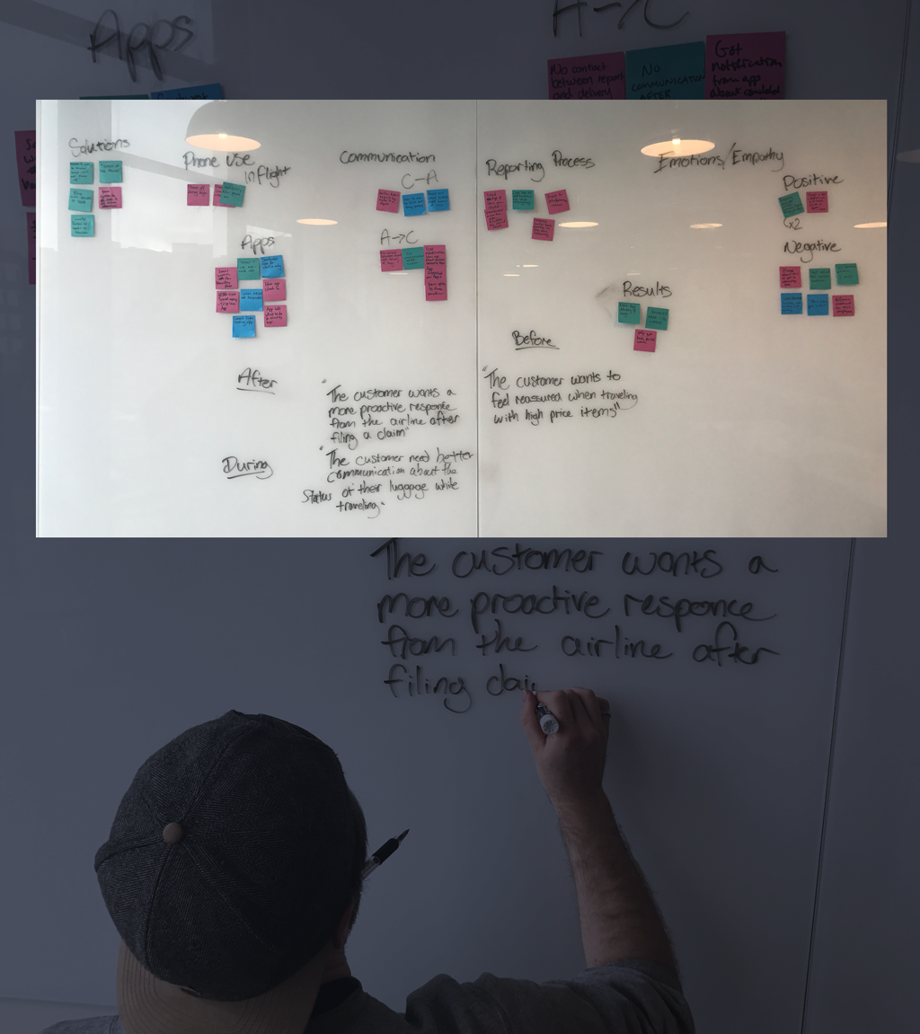
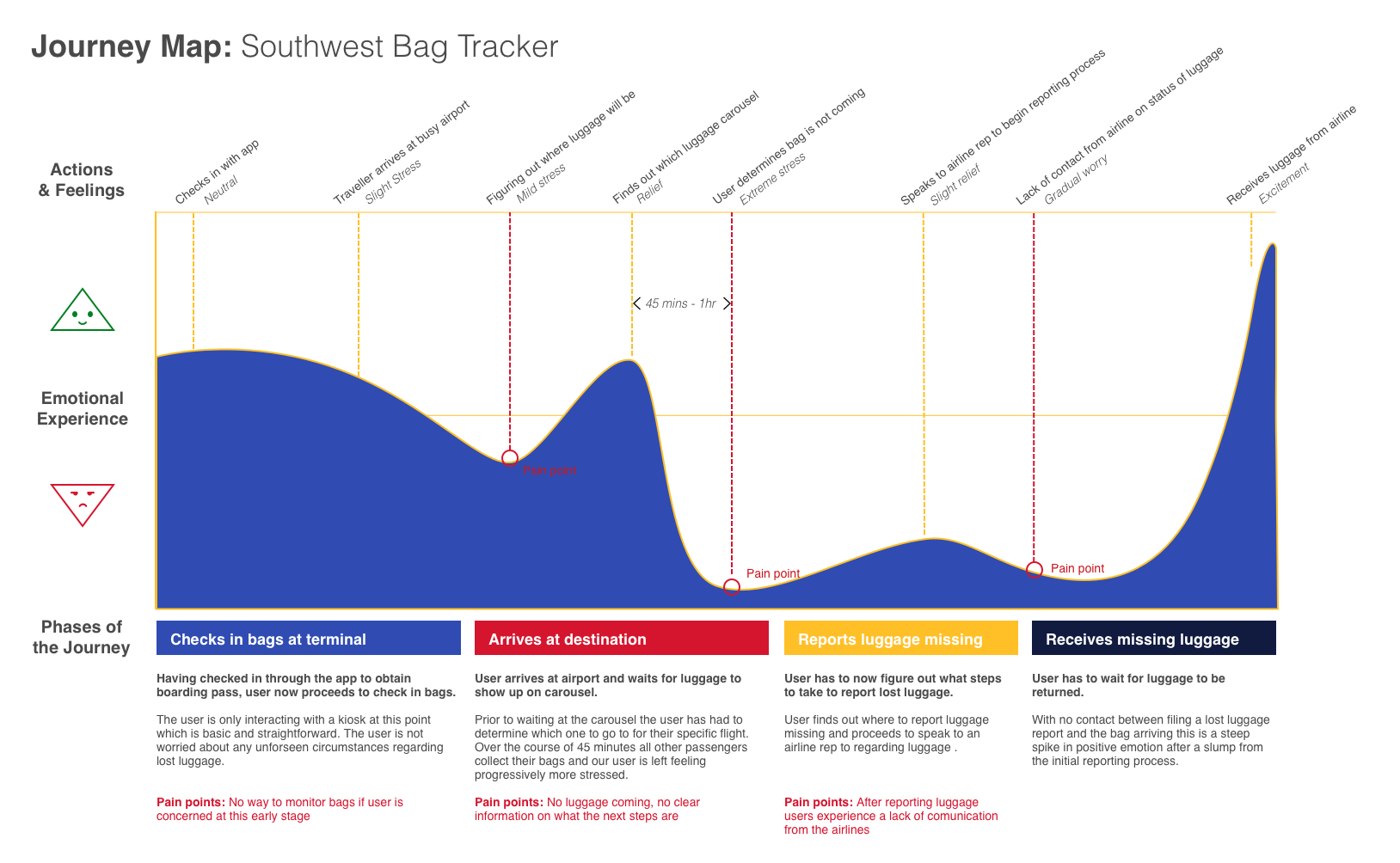
After our first round of interviews, we regrouped as a team and created an affinity map to identify recurring patterns and themes based on our users’ responses. Users cited the growing anxiety one feels at the carousel as other passengers begin leaving with their things. Many users felt there was not enough proactive communication from the airline regarding their luggage and more could have been done on the backend to keep them informed after luggage is delayed. After identifying specific pain points, we began developing personas, problem statements, and a User Journey Map.
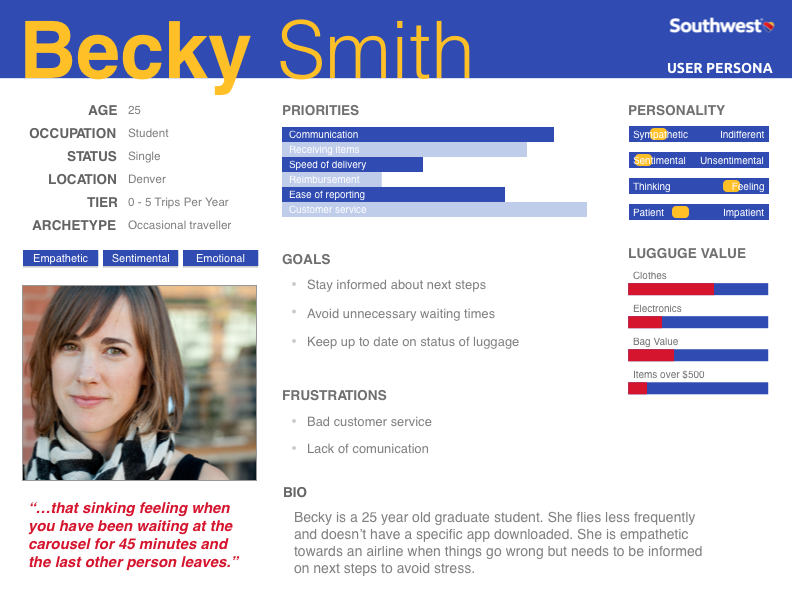
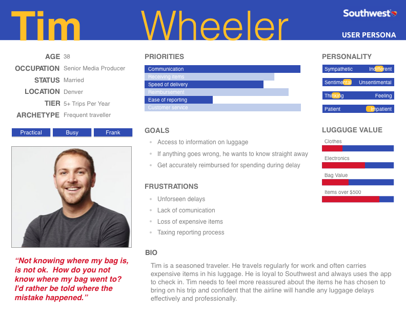
PERSONAS
PROBLEM STATEMENTS
- Before flight - Users want to feel reassured that their luggage is in good hands as they check in
- During flight - Users need better communication about the status of their luggage, specifically when worried about connecting flights
- When things go wrong - Users need more proactive communication from the airline when luggage goes missing/will be delayed
USER JOURNEY MAP
IDEATE
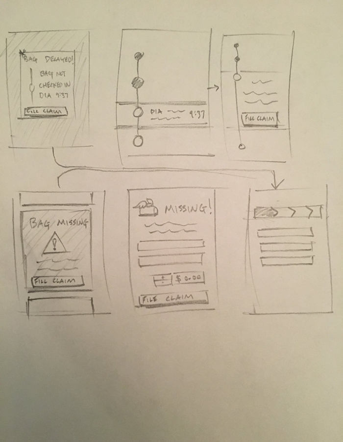
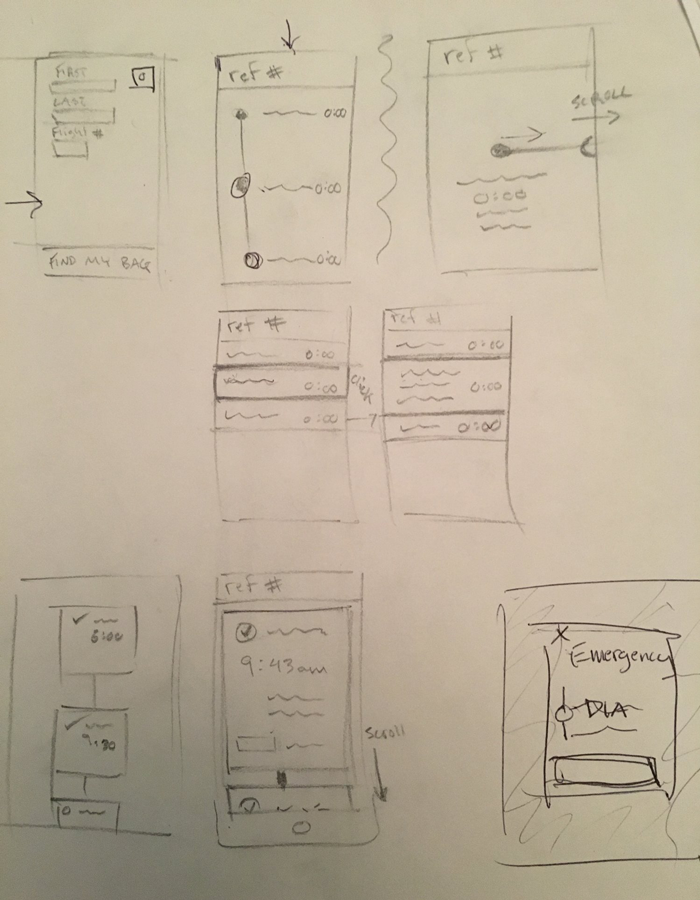
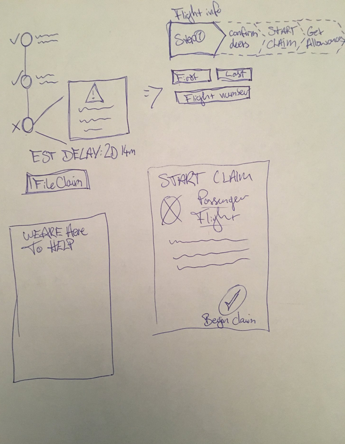
Once we had a clear understanding of the of the problems we wanted to solve, we began the process of collaborative ideation for solutions to test. This included doing a design studio where we each sketched lo-fi wireframes and combined some of our initial individual design ideas, followedby Lo-Fi Wireframes designed in Sketch to be used for user testing.
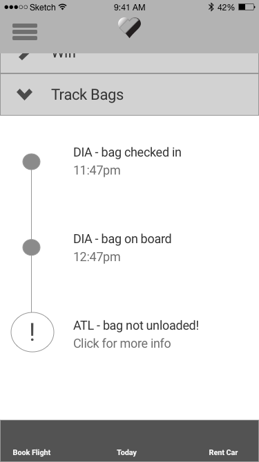
Our initial solution focused on the problems at each stage of the user journey timeline. We wanted anxious passengers to feel reassured from the moment they check in by emphasizing Southwest's customer-driven branding. Second, we wanted passengers to have the option to track their bags and receive real time notifications on the status of their bag throughout the flight. Finally, if anything were to go wrong, a notification would be sent to the passengers, and they would have access to the 'delayed luggage' form through the app, as well as continued bag tracking during the retrieval process.
PROTOTYPE
Once we had narrowed down the lo-fi sketches and established a user flow, we designed medium-fidelity wireframes in Sketch and assembled a clickable prototype in Invision for a first round of usability testing.
EXPERIMENT
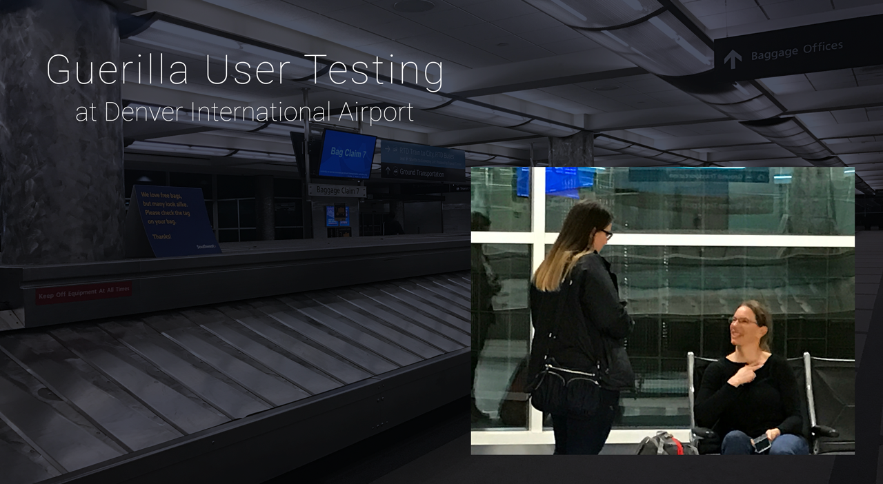
We tested our initial wireframes and made several key improvements to our design. We used a combination of an online user testing platform, guerilla user testing, and scheduled in-person tests. Users were given two different scenarios for the test. The first was to be under the assumption they had checked in via the app and were tasked to track their bags in the app because they were worried about their connecting flight in Atlanta. The second was to negotiate a 'baggage alert' notification and the following reporting process. The insights we pulled from these tests informed our design decisions for the second iteration.
USABILITY TEST RESULTS - 2ND ITERATION
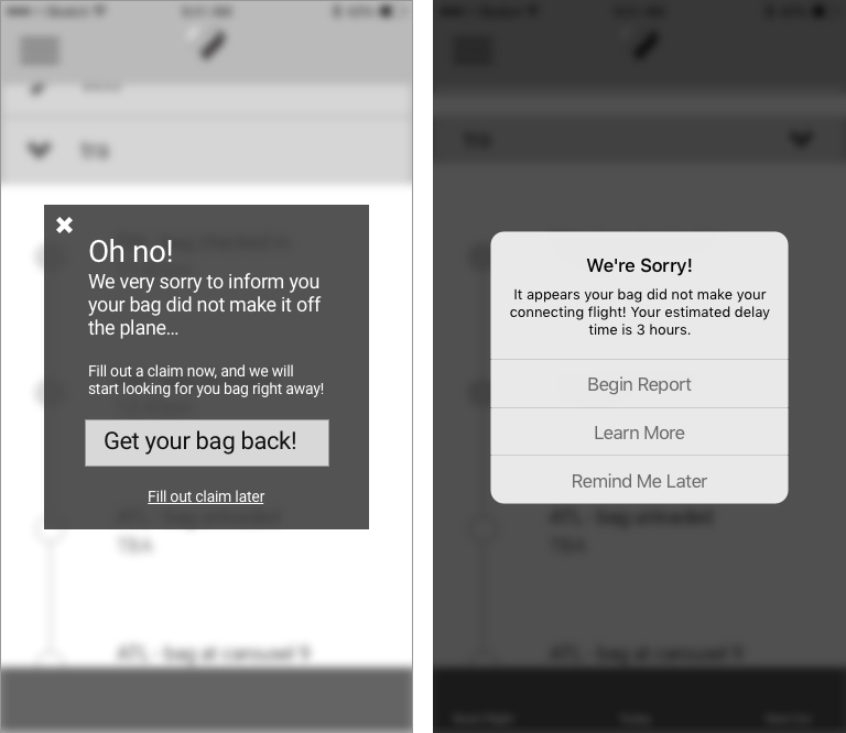
EMPAHTY THROUGH LANGUAGE
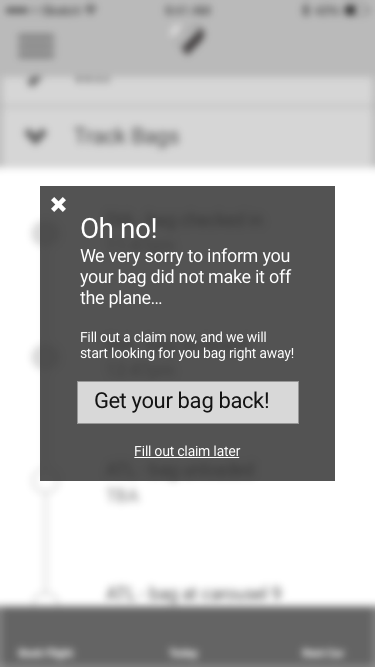
Users voiced concern about the tone of our initial alert message. "Oh no!" did not seem like a thoughtful, caring response. Additionally, the icon for the alert was too alarming and conjured up mixed notions on the intent of the notification. Given that this experience would be a particularly stressful experience multiple participants mentioned they would want this alert message to be more reassuring and professional. Secondly the call to action drew questions like "Wouldn't they already be looking for my bag...?" We decided make the modal fit the familiar iOS HIG guidelines, as well as providing an option allowing users to see how the process works before jumping into it.
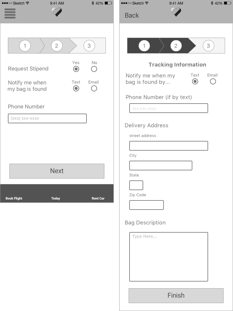
COLLECTING CORRECT INFORMATION
We found that participants gave us good feedback on what kind of information they would expect to be collected as they went through the reporting process. We had a participant mention that if they were traveling they would want to know that they could give a delivery address for the luggage through this reporting process. Our design change here addresses that concern.
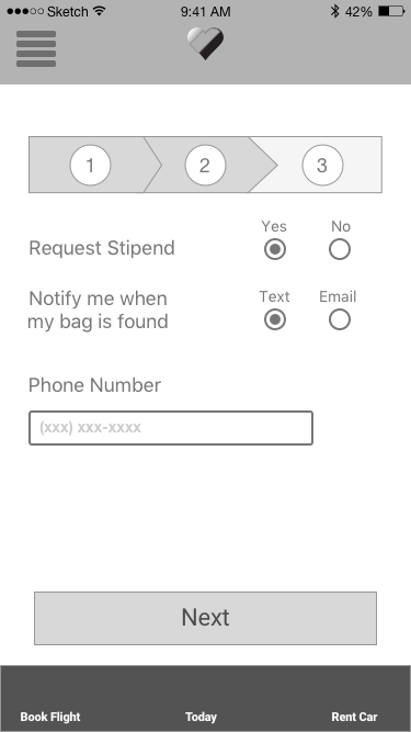
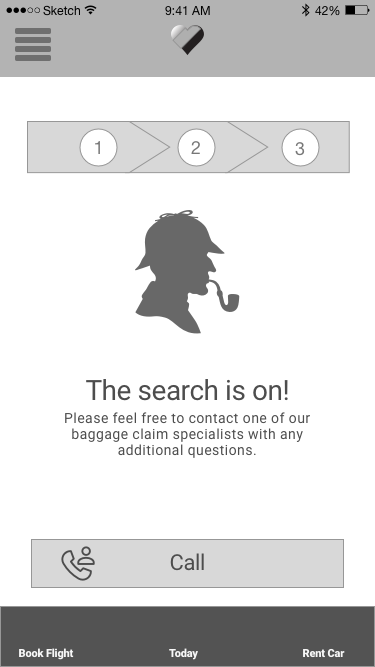
USABILITY TEST RESULTS - 3RD ITERATION - HI-FI MOCKUPS
After a second round of usability testing we addressed some final design issues as we moved into our third iteration - high fidelity mockups.
NEW USER FLOW STRATEGY - UTILIZE AIRPORT CHECK-IN KIOSK
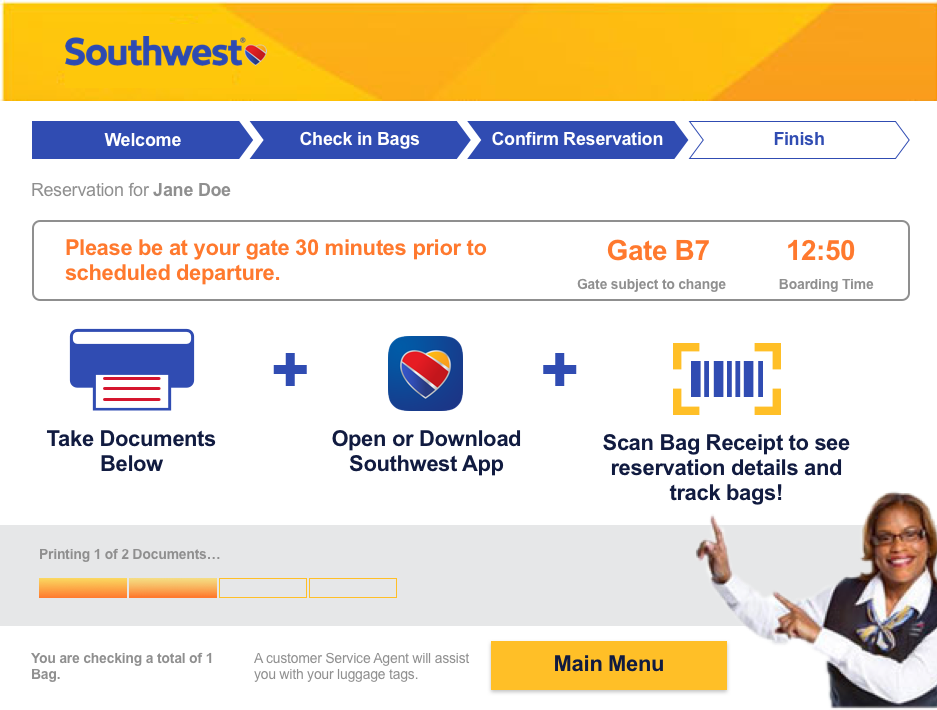
We realized that regardless of a user's persona, the user is very likely to use a kiosk screen to check their bags in or in other cases is guided through the kiosk process by an attendant. By leveraging these screens we were able to initiate a dialogue with the user and help him/her understand the bag-tracking feature available in the app.
We designed a kiosk page that would act to inform users who are not checking in with the app about the track your bag feature. As shown earlier, although 60% of our survey participants had an airline specific app we didn't want to ignore the large 40% that did not.
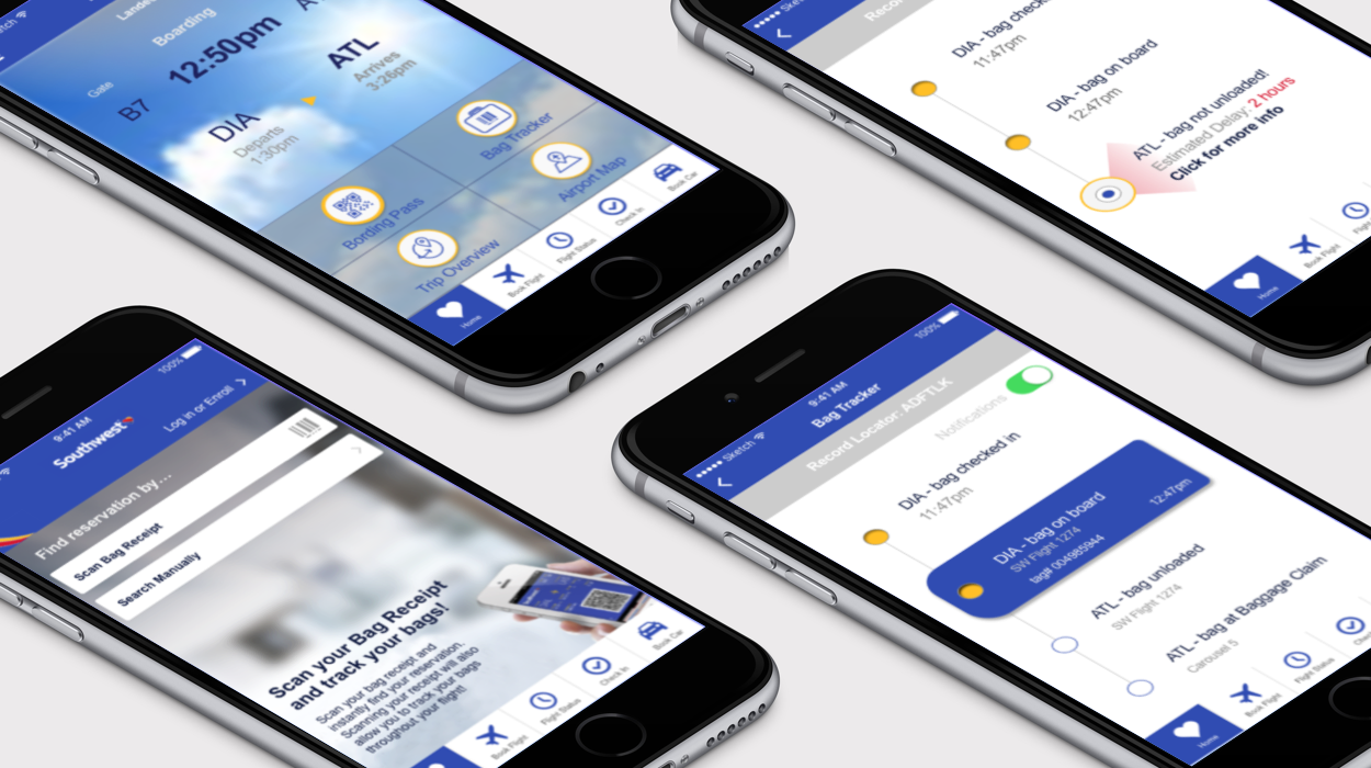
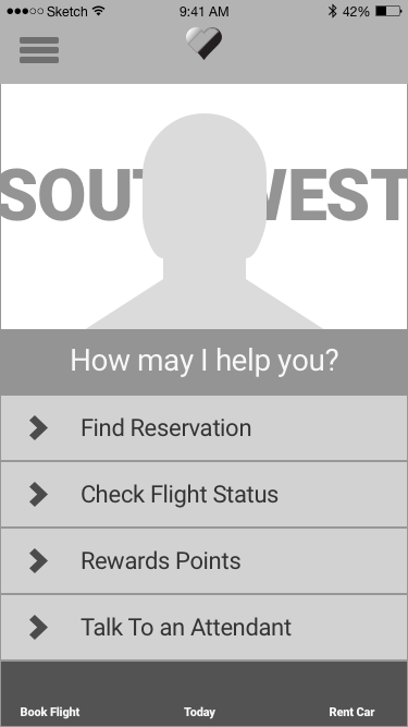
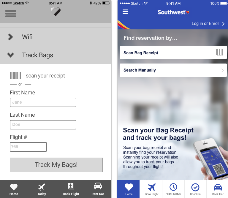
REVISED LAUNCH SCREEN AND DASHBOARD
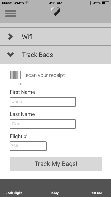
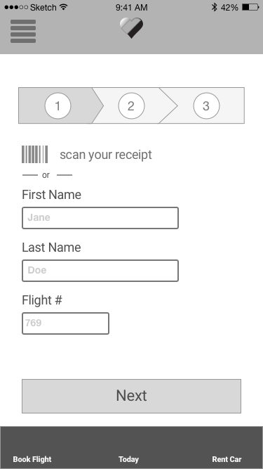
In this iteration we went back to using Southwest's original home screen with slight modifications. Now when the app is opened users are prompted to scan their receipt, automatically finding their reservation information and bag-tracking information.
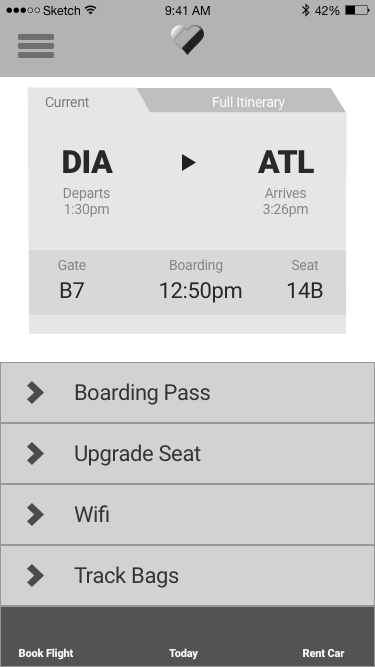
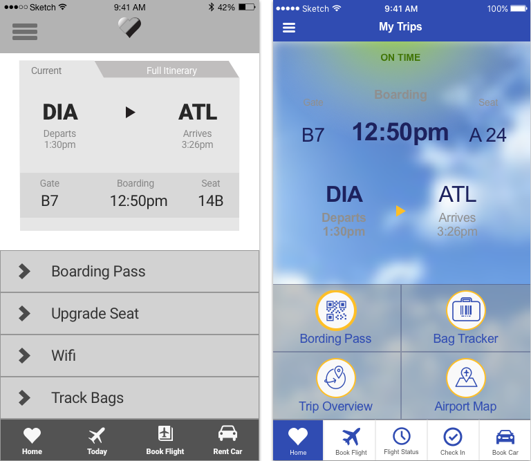
The new UI on the flight information page highlights the bag-tracking feature with an icon and a reorganized, foursquare navigation. This new solution aims to put the user into the bag-tracking flow as simply and early in the process as possible.
REFLECT
In conclusion, our feature design generally received positive feedback and many users were surprised that Southwest did not already offer this service. I believe usability testing was the most informative part of this process.
This was also a great learning experience by working collaboratively with two fellow UXers. Dividing up tasks and keeping everyone on track was my official role, but I also contributed a great deal to the interviews and usability tests.